🤔 The Problem with Traditional Media Queries
Let's be honest, we've all written tons of repetitive media queries in our SCSS files. You know how this works: copy-paste the same breakpoints over and over, hoping you didn't miss any or mess up the values. It's tedious, error-prone, and a real pain to maintain when your design system changes.
Here's a pattern that probably looks familiar:
.button {
  // Default desktop styles
  font-size: 1.2rem;
  padding: 15px 30px;

  // Tablet styles
  @media (max-width: 992px) {
    font-size: 1rem;
    padding: 12px 25px;
  }

  // Mobile styles
  @media (max-width: 768px) {
    font-size: 0.9rem;
    padding: 10px 20px;
  }
}
This desktop-first approach with multiple max-width queries has several drawbacks:
- It follows an outdated desktop-first paradigm
- It lacks a standardized system for breakpoints
💡 A Better Way: The Respond-To Mixin Pattern
The respond-to mixin creates an abstraction for media queries that makes your code more maintainable, consistent, and follows modern mobile-first principles.
Step 1: Define your breakpoints in a central location
$breakpoints: (
  'sm': 576px,
  'md': 768px,
  'lg': 992px,
  'xl': 1200px
);
Step 2: Create the respond-to mixin
@mixin respond-to($breakpoint) {
  @if map-has-key($breakpoints, $breakpoint) {
    @media (min-width: map-get($breakpoints, $breakpoint)) {
      @content;
    }
  } @else {
    @warn "Breakpoint '#{$breakpoint}' not found in \$breakpoints map.";
  }
}
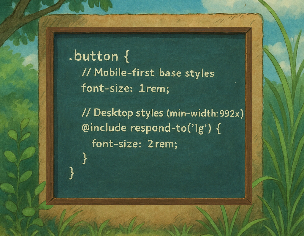
Step 3: Use the mixin in your components
.button {
  // Mobile-first base styles
  font-size: 0.9rem;
  padding: 10px 20px;

  // Tablet styles (min-width: 768px)
  @include respond-to('md') {
    font-size: 1rem;
    padding: 12px 25px;
  }

  // Desktop styles (min-width: 992px)
  @include respond-to('lg') {
    font-size: 1.2rem;
    padding: 15px 30px;
  }
}
🌟 Benefits of the Mobile-First Approach
Mobile-first has become the industry standard for responsive design because it aligns with how users access content today. With most web traffic coming from mobile devices, starting with the smallest viewport ensures optimal user experience across all screen sizes.
Benefits:
- Progressive Enhancement: Design for mobile first, then enhance for larger screens
- Simplified Code: Less overriding of properties across breakpoints
- Better Performance: Mobile users don't download unnecessary styles for desktop
🫠 Advanced: Desktop-First
While mobile-first is recommended for modern development, you might occasionally need max-width queries for specific use cases. Here's how to extend our system:
// Additional mixin for desktop first or edge cases
@mixin respond-to-max($breakpoint) {
  @if map-has-key($breakpoints, $breakpoint) {
    @media (max-width: map-get($breakpoints, $breakpoint) - 1px) {
      @content;
    }
  } @else {
    @warn "Breakpoint '#{$breakpoint}' not found in \$breakpoints map.";
  }
}
Example use case:
.special-element {
  // Default mobile-first styles

  // Only apply these styles below the 'lg' breakpoint
  @include respond-to-max('lg') {
    display: none;
  }
}
Important note: You can use respond-to-max but be aware that doing so you are not following the mobile-first pattern. For most cases, stick with the mobile-first respond-to pattern for cleaner, more maintainable code.
🔄 Migrate from Desktop-First to Mobile-First + respond-to
Here's a practical guide to migrate your existing styles:
Before (Desktop-First):
.card {
  // Desktop default
  display: flex;
  padding: 2rem;
  margin: 2rem;

  // Tablet
  @media (max-width: 992px) {
    padding: 1.5rem;
    margin: 1.5rem;
  }

  // Mobile
  @media (max-width: 768px) {
    display: block;
    padding: 1rem;
    margin: 1rem;
  }
}
After (Mobile-First with respond-to):
.card {
  // Mobile default (smallest screen)
  display: block;
  padding: 1rem;
  margin: 1rem;

  // Tablet (min-width: 768px)
  @include respond-to('md') {
    display: flex; // 💡 Key migration point! See explanation below
    padding: 1.5rem;
    margin: 1.5rem;
  }

  // Desktop (min-width: 992px)
  @include respond-to('lg') {
    padding: 2rem;
    margin: 2rem;
  }
}
Remember to create the breakpoints and the
respond-tomixin as stated above in💡 A Better Way: The Respond-To Mixin Pattern
Migration steps:
- Move the mobile-specific styles to be the default styles (outside any media query)
- Replace
max-widthqueries withmin-widthusing therespond-tomixin - Be careful with properties that apply across multiple breakpoints (explained in detail below)
Mind the Tricky Details
Look at how we moved display: flex from the desktop default to the tablet breakpoint. This is a perfect example of the functional translation required:
- In the original desktop-first code,
display: flexwas applied to both desktop and tablet (it was overridden only for mobile) - In our mobile-first version, we start with mobile styles (
display: block), sodisplay: flexneeds to be applied at the tablet breakpoint to maintain the same visual outcome
This shift isn't just about reorganizing code. It's about preserving the same functionality while changing our starting point. In desktop-first, you subtract complexity for smaller screens; in mobile-first, you add enhancements as screens get larger.

📚 Conclusion
The respond-to mixin pattern with a mobile-first approach is a powerful technique for creating clean, maintainable responsive designs. By centralizing your breakpoints and using a standardized system for applying media queries, you'll improve your development process and create a more consistent user experience across devices.
Give this pattern a try in your next project. I think you'll be surprised at how much it simplifies responsive design!